graduate collection 2019/20: modernability
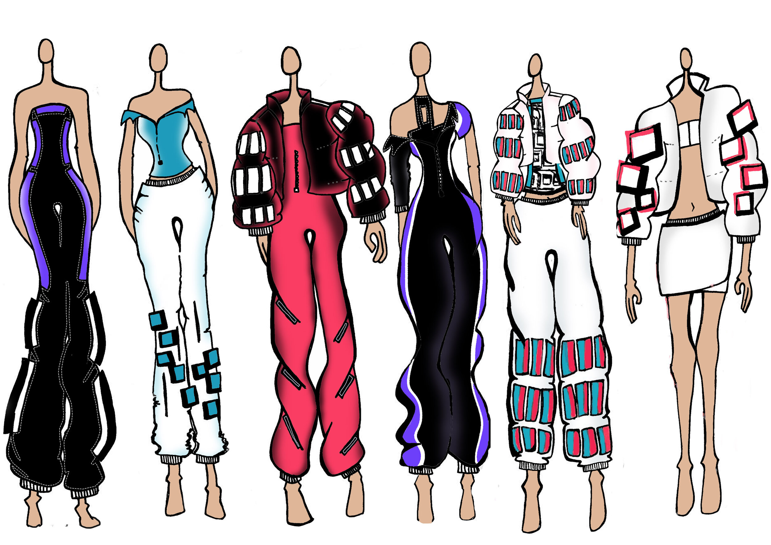
At my final year of university, I created a collection that highlighted the novelty of futuristic aesthetics. As time moves forward, humans have an innate desire and ability to reflect and reminiscence. This desire to project into the past explains our fascination with retro aesthetics. On the other hand, the unwritten future is a world of possibility, wonder and unknown. It’s this combination of ideas that unpinned the rise of the retro-futuristic aesthetic and therefore created Modernability, based in Amsterdam.


An expression of sensuality and enhanced romanticism is curated in this collection. Highlighted elements depict innate feminine features and highlight the female body. The aim in which to prove a sense of empowerment, through vulnerability and intimacy. This theme allowed a certain playfulness that captures the perception of this powerful representation; that vulnerability presents strength. Below shows my process from the original inspiration to final results. Published in print and online in Feorce Magazine November Vol 6, cover and 10-page spread in Mob Journal Vol 10 #38 Edition and online at Pattern Magazine.
To see more, check out the fashion design page here.


sTieglitz internship ss19
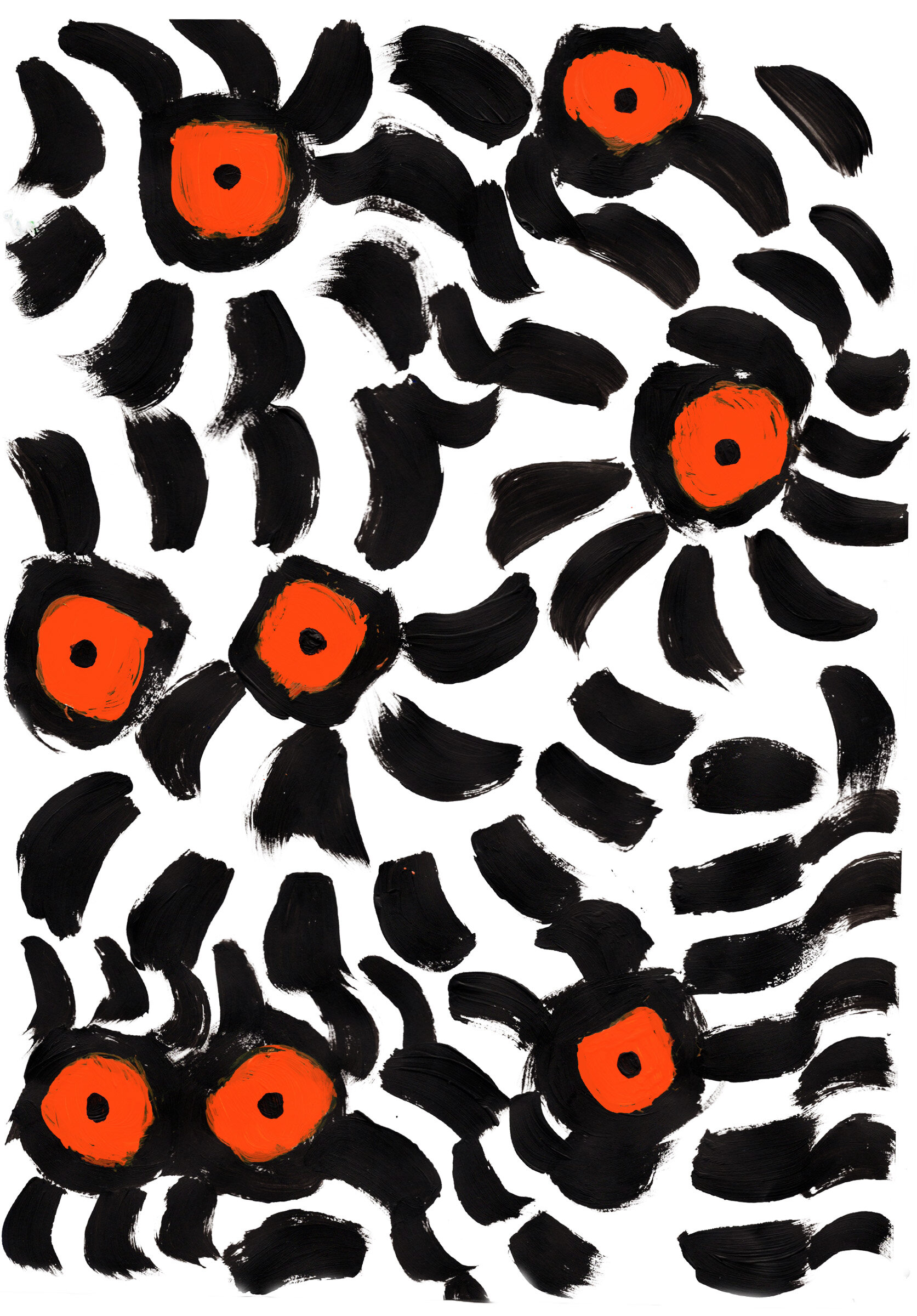
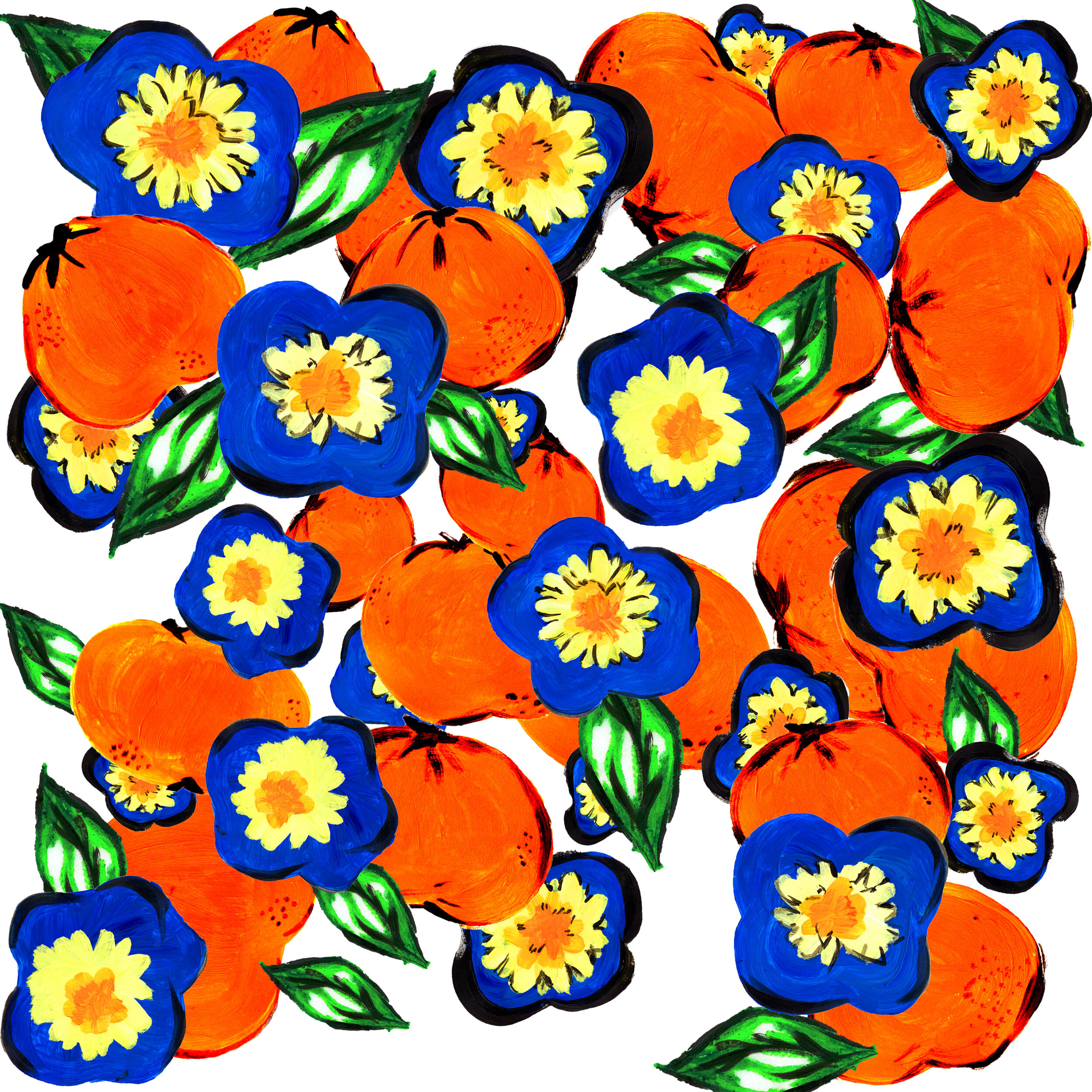
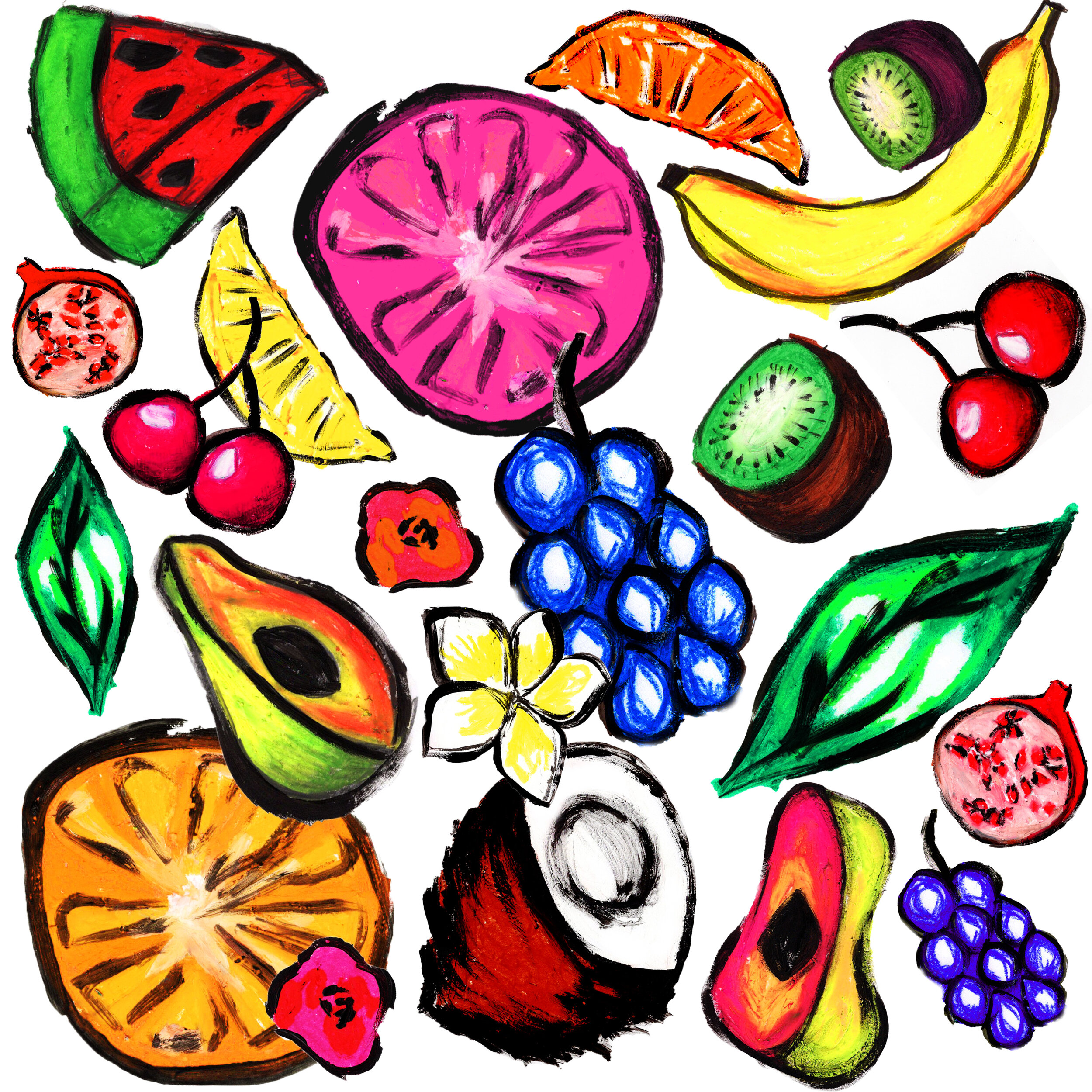
During my internship, I illustrated graphic prints that were used on 11 collection pieces for the upcoming S/S19 Madagascar collection, as well as curated the social media pages with GIFs, hand-drawn illustrations, using Photoshop, Illustrator & Indesign.
I curated the design through the abstract brief from leadership. After developing the print with colour, different drawings, logistical placement, I worked with the technical department to assess if it was the right quality, resolution and size ready for production. I illustrated and curated graphics to share on social media, by hand and with Adobe Creative Suite.
To see more, check out the graphics page here.


New kids turbo f/w17
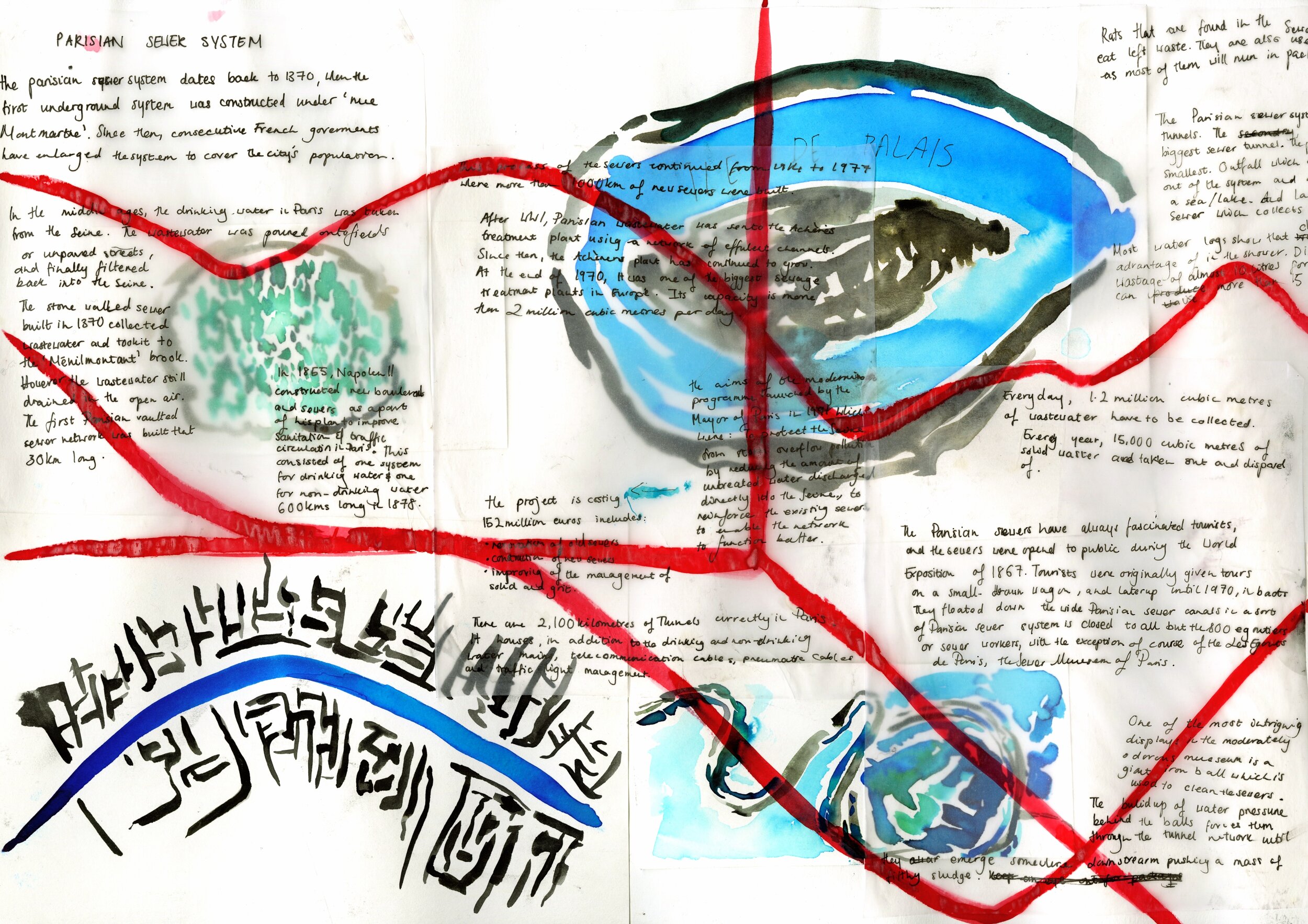
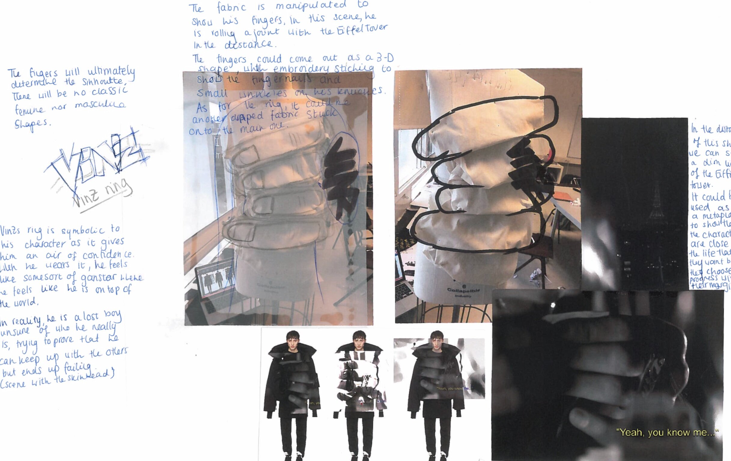
This project matured from the film “La Haine”, which story focuses three outcasts living in the suburbs of Paris. Analysing the emotions of the characters gave the tone of the collection, whilst the abstract cinematography provided the silhouettes.
Before heading into stand work, I looked at over-sized, unisex shapes that I was inspired by to start developing the tone of the collection.
I sketched small drawings just to give some visual idea for the silhouette which would then be realized by standwork.
I pulled clips that were crucial to the story and held the most emotional value whilst understanding the emphasis of conceptual cinematography.
I draped the fabric in ways that would behold these memorable moments in the film. Beginning the design development process with sketches of stand work.
The intricate details of each draping technique were experimented on different parts of the body to analyse each final outcome.
To see more, check out the fashion design page here.




Digital studies: 2015 - 2020
Below, features mood boards, graphic prints enhanced with Photoshop and Illustrator, and a brief review of textile print for a university project.
My father is an artist (Salam Kanaan) who draws the landscapes of Amman. With his love of Amman instilled in me from a young age, the textile project originated from simple illustrations of the landscape and evolved into patterns imagined with Photoshop and Illustrator. I ironed crackling paper to create dynamic shapes for the graphic opportunities, to develop the textile element of this project. With experimentation and development of colours and scale, I overlapped my favourite print into illustrations to imagine the possibilities.
To see more, check out the graphics page here.




International baccalaureate aRT 2015
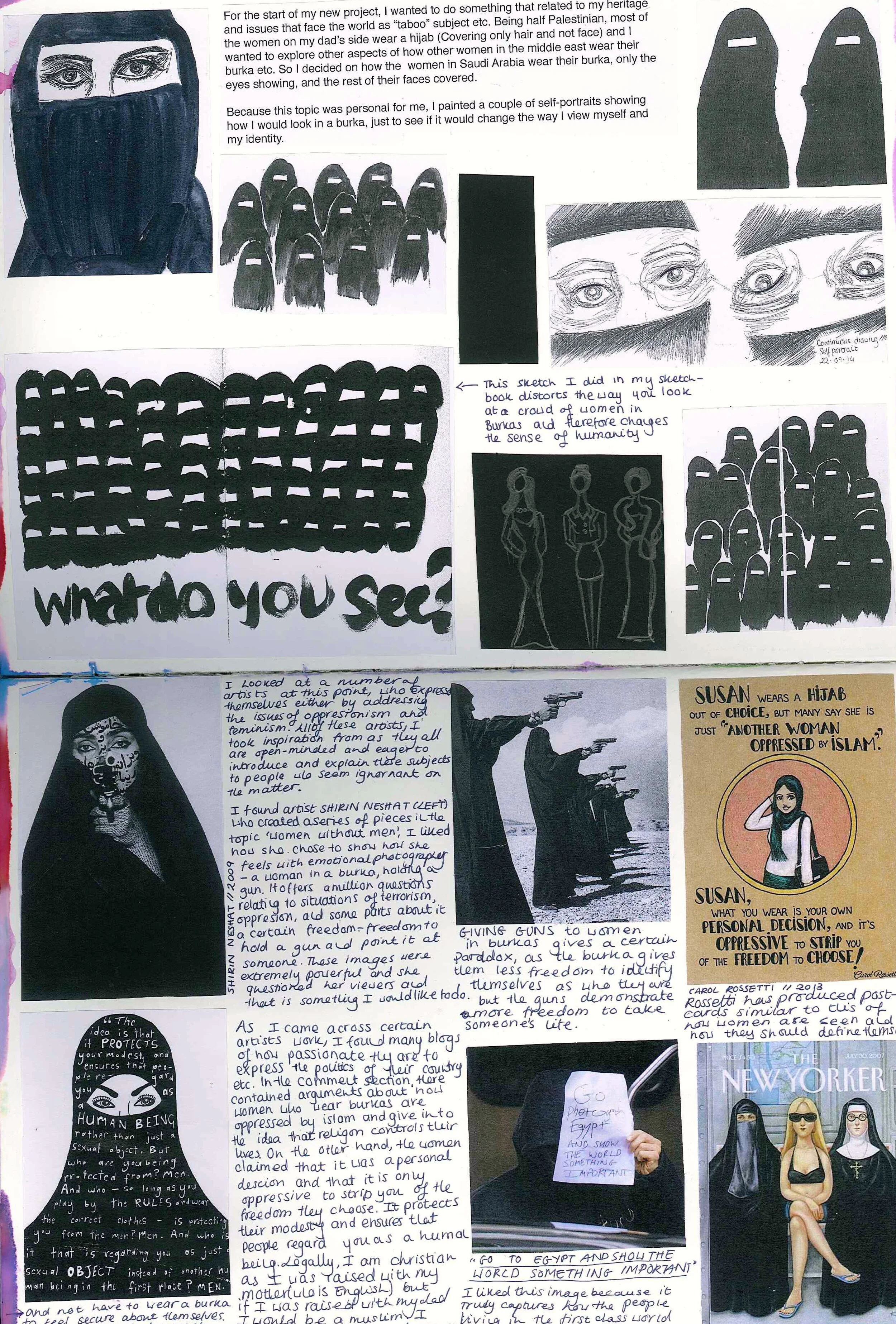
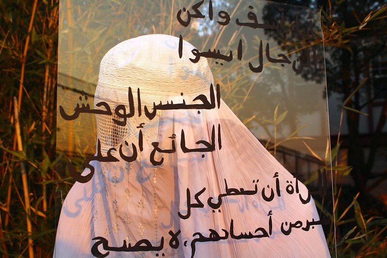
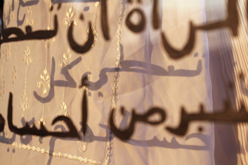
In my last year of higher education, for my Art & Design IB projects, I referred back to my Jordanian heritage. My focus fell on the depiction of Muslim women in the media and how their voices are often shunned. In order to represent those voices, I began interviews with women who belong to the Islamic community, specifically those who wear the hijab. Below are multiple art pieces that demonstrate their voices and the often misrepresentation that are oppressed, when in fact it is oppressive to strip them of the freedom to choose.
Olive trees are a symbol of peace in Palestine. Hundreds and thousands of trees grew in the fertile soil. Due to the constant Israeli–Palestinian conflict since 1948, these olives trees are disappearing. In contemporary motion, the symbol of peace has now become a symbol of war, therefore the olive tree is represented through the construction of guns.
To see more, check out the development/process page here.


lOOKING INTO RAW AW17
Based on the brief of "Diversity”, I researched global photographer Jimmy Nelson's series of The Siberian Arctic and Northern Africa. The two photo series had such parallel differences that I developed a collection based on such extremes for a harmonious balance.
To see more, check out the fashion design page here.
DRAWING STUDIES: 2015 - 2020
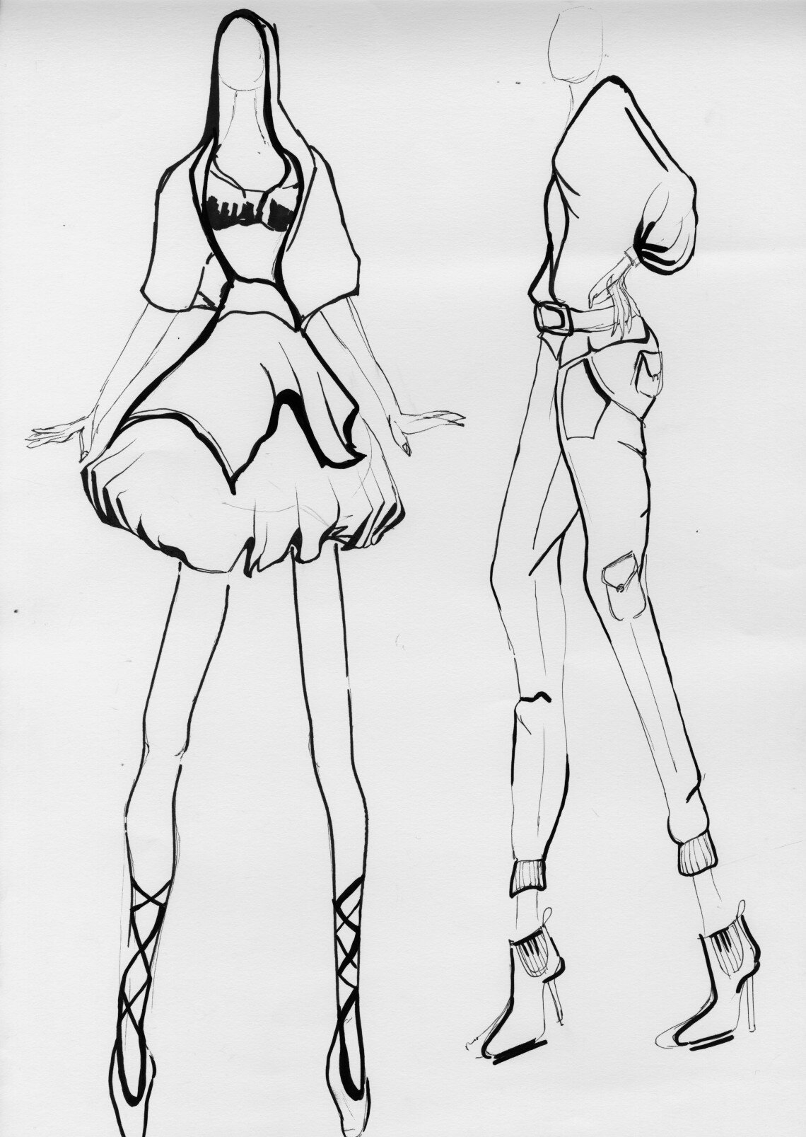
Below features drawing studies over the years, whether it be for university projects or personal projects. They feature hand-drawn illustrations and small development of design silhouettes and shapes.
To see more, check out the drawing studies page here.


